The Challenge
Auto loan websites, especially ones targeting people with bad credit, tend to look and feel off-putting. Aggressive CTAs, overwhelming fine print, promises that feel too good to be true.
The challenge was to build something that felt like the opposite of that: trustworthy, calm, and straightforward, without losing the urgency that actually gets people to apply.
The design had to work hard to earn trust before asking for anything. Every section, every line of copy, every visual decision was measured against one question: does this make someone feel more or less comfortable moving forward?
The Audience
Waypoint's users aren't first-time car buyers browsing casually. They're people who've already been turned down elsewhere and are approaching this with some hesitation. The design needed to meet them there — honest, straightforward, and low pressure from the first second they land on the page.
The Process
I started with a wireframe to map out the section flow before any visual decisions were made. Once the structure was in place, I moved into visual exploration — a couple of different directions that each took the brief in a slightly different way. The client chose their favourite and we built from there, refining through a few rounds of feedback until it was ready to launch.
I started with wireframes to map out the section flow before making any visual decisions. Part of that process was looking at how other lenders in this space structured their websites, and a pattern showed up pretty quickly: buried applications, too many menu options, and no clear path forward. I wanted Waypoint to be the opposite of that. One clear path, with every section moving users toward the application instead of giving them more decisions to make.
From there, I moved into visual exploration. I explored a couple of different directions, each taking the brief in a slightly different way, but the goal stayed the same: avoid anything that felt overly corporate or bank-like. A lot of these users have already been turned away by traditional lenders, so I wanted the site to feel more approachable from the start. Once the client chose their preferred direction, I built from there.
Once the page was fully laid out, I stepped back and looked at the experience as a whole. That's when I noticed the hero was trying to do too much. It introduced the service, but it also repeated the same step-by-step process that users would see in the dedicated "How It Works" section below. Since they were already heading there by scrolling or through the navigation, the extra explanation wasn't adding much. I removed it so the hero could focus on one job: helping users understand what Waypoint offers and encouraging them to take the next step.
The Logo
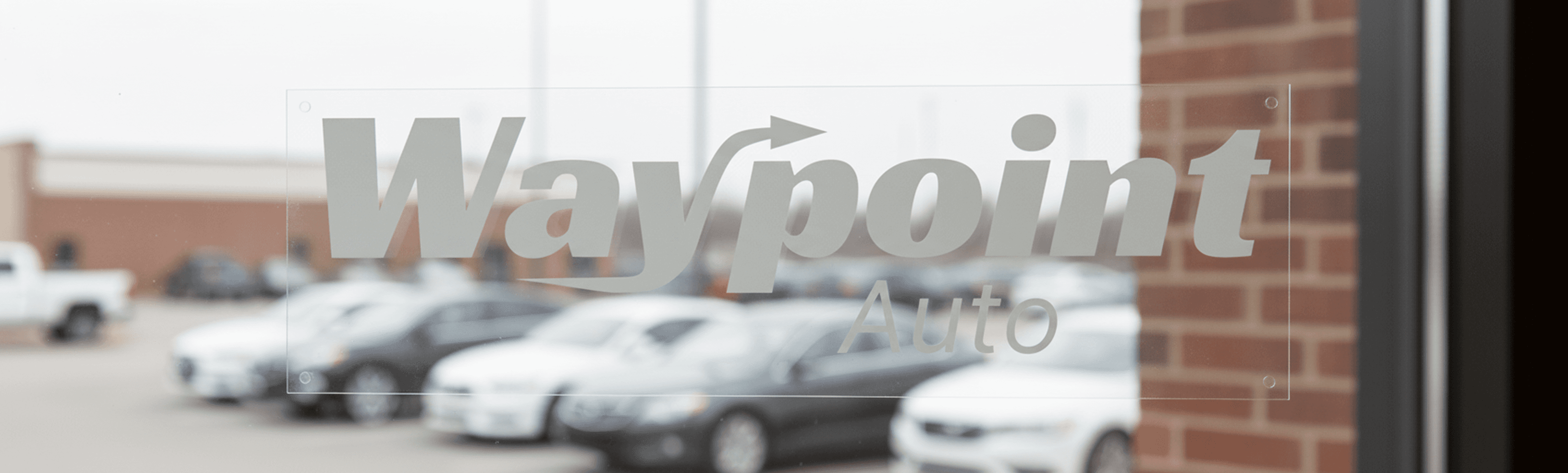
The name "Waypoint" already does a lot of the work. It implies direction, progress, getting somewhere. I built on that with a custom logotype set in Racing Sans One, with the upper-right stroke of the Y extended into an arrow.
It's subtle enough to feel intentional rather than showy, but once you see it you can't unsee it. The kind of detail that makes a logo feel considered rather than just typed out.


Visual Direction
Most financial websites play it safe. White backgrounds, blue accents, stock photos of happy families. For Waypoint I went a different direction: a dark base with a sharp lime green as the primary accent.
It felt right for the audience — people who are used to bold, confident design in other areas of their life deserved something that matched that energy, not the usual corporate blue that dominates the financial space.
The sharp lime green wasn't just a visual choice. Green is usually associated with approval and moving forward, and the yellow in it gives it an optimistic, energetic feel rather than something flat or safe.
For a brand built around giving people a green light, it felt like the only colour that made sense. It also draws the eye straight to the CTA button. Everything else steps back, and that one action stands out.

The Website
The site is designed around one goal: get the user to apply. The main page guides the visitor through a clear sequence and ends at a dedicated apply page built for conversions. That also makes it easy to run paid ads straight to the apply page, no distractions in the way.
The flow goes: here's what we do, here's how it works, here's who it's for, here's proof it works, now apply. No detours, no clutter. Each section answers the question the visitor is probably asking before they feel ready to move forward.
Social Proof That Feels Real

The review section uses real photos of customers standing next to the cars they got approved for, not generic headshots.
Anyone can write a five-star review, but a photo like that is hard to fake. It makes the whole page feel more credible without having to say "trust us."
Intentional Choices
The Conversion Page
While the homepage focuses on building trust and explaining the product, the pre-approval page is built around a single goal: conversion.
The layout follows a proven landing page structure. Social proof comes first, followed by content that addresses a common objection, then the form itself. Additional trust signals appear below for users who need more reassurance before taking the next step.
To keep the experience focused, I removed anything that could distract from the primary action. There’s no navigation or links leading users elsewhere. The homepage CTA directs users straight to this page, and its standalone URL allows paid ad traffic to land here directly, creating a clear and focused conversion path.

The Details Matter
The "Who this is for" section lets the right people self-identify instantly. New to Canada, self-employed, rebuilding credit, previous declines. If you see yourself in that list, you know this is for you, without having to read through paragraphs of text.
The trust signals and the FAQ are placed right before the final CTA, not as an afterthought, but to catch any last hesitation before asking for the conversion. Every section earns the next one.
Iterations
After the initial build, I revisited a few decisions that weren’t fully serving the experience. These weren’t fixes — they were refinements that came from sitting with the design and asking what could work better.
1. Sticky navigation with liquid glass effect
On a long single-page site, users need an easy way to move between sections without having to scroll endlessly. I added a sticky navigation bar with a frosted glass effect that stays visible without distracting from the content. It helps users keep their place, jump to what they need, and makes the experience feel more polished overall.
2. Hero — from static image to video
The hero needed something that put you in the feeling of driving before any copy was read. I swapped the static image for a video of a steering wheel with sunlight breaking through. It now has a more atmospheric feel and immediately grounds the user in the product. It sets the tone before a single word is read.

3. Footer redesign
I gave the footer a bit more structure by adding a third column with a clear "Get Started" action, a short description of the brand, and a cleaner layout for the copyright and legal links. It helps the page end in a way that feels more polished and purposeful.


The Result


The site launched and is live at waypointauto.com, clean, fast, and built to convert. A brand that went from nothing to something that actually looks like a company people would trust.
Brand Identity, Web Design
A brand and website built from scratch for a Canadian auto loan matching service. The goal: make people who've been turned down before feel like this time might actually be different.

I handled everything from the ground up — logo, brand identity, and the full website design and build in Framer. The project took about two months from first meeting to launch.


