UI Kit, UX Research, Responsive Design, Team Collaboration
This project won the CICCC Client Choice Award — selected by the client from all competing teams as the best overall solution. Over four weeks, our team of UX designers took a media brand's website from a scattered, hard-to-navigate experience to a focused, conversion-driven platform built around its community.
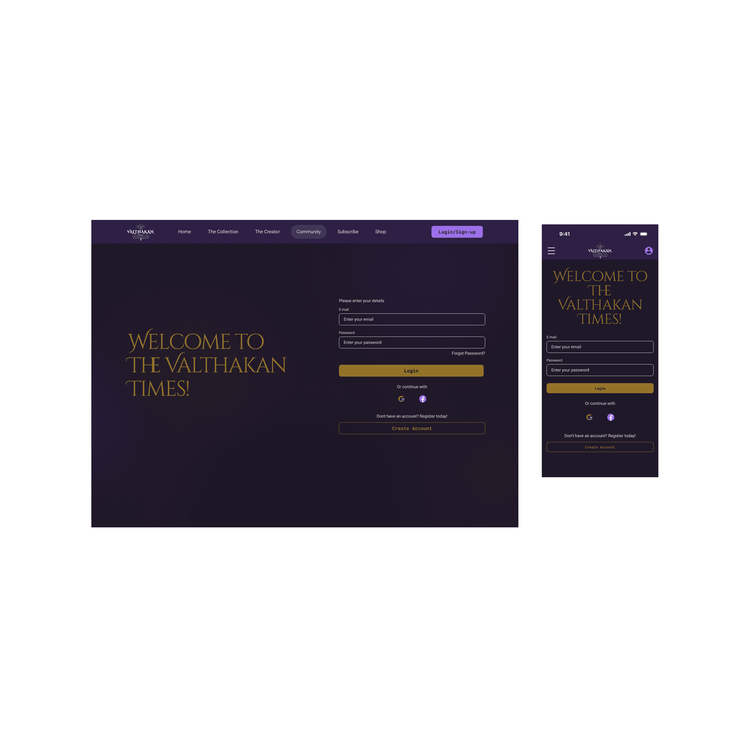
My role covered the full UX process alongside the team, plus sole responsibility for designing three pages that directly impacted the client's conversion goals: the Membership Pricing page, the Login page, and the Community hub.

About The Client
The Valthakan Times is an independent media brand created by Daniel — a mix of long-form newsletters, opinion pieces, podcasts, and community content spread across TikTok, Discord, Patreon, YouTube, and Spotify, with a growing global audience.
From a business perspective, Daniel had three main goals for the redesign: increase newsletter sign-ups (free and paid), convert more readers into paid supporters, and make partnership opportunities easier to find for brands interested in advertising or collaborating with him.

The Challenge
The existing site had a high churn rate, low conversion rates, and limited awareness of the platform’s full offering. Users weren’t finding what they were looking for, and the paths to the actions Daniel most needed (newsletter subscriptions, Patreon upgrades, partnership enquiries) weren’t clear enough to convert.
The design had to do more than look good. It needed to guide different types of visitors (casual readers, loyal community members, and potential brand partners) toward the right actions without overwhelming any of them.
Project Goals
Create a mobile-first, intuitive navigation system
Encourage newsletter subscriptions and upgrades to paid tiers
Give first-time visitors a clear starting point
Simplify access to partnership information to support advertising revenue
Research
Our team focused on understanding the client, the users, and the existing website experience. We ran a heuristic evaluation, competitor analysis, and desk research to surface usability issues, industry patterns, and opportunities for improvement.
To make sure the redesign addressed real needs, we built two personas: a loyal reader likely to subscribe, and a brand partner evaluating the client for a potential collaboration. Journey mapping and a clear problem statement helped us pinpoint the specific friction points (unclear navigation, inconsistent page structure, and mobile hierarchy issues) that became the foundation for every design decision that followed.

Key Insights
Users struggled to navigate the website efficiently
Visual identity and content structure felt outdated
The site lacked a clear path to conversion for newsletter sign-ups and Patreon
The client’s active community was a unique strength that competitors lacked and one that wasn’t being fully used.

Ideation & Concept Development

With research insights in hand, we explored solutions across several methods, each one building toward a clearer picture of what the site needed to become.
HMW (How Might We) sessions turned key user frustrations into open questions that pushed us toward better navigation, content clarity, and conversion paths
Mind mapping helped visualize the relationships between content types and how users might move through them
We mapped out the key journeys for newsletter sign-ups, Patreon conversions, and Discord engagement through user flows and a sitemap, all before we began the interface design.
Wireframes and high-fidelity mockups brought the structure to life, testing how layouts and visual hierarchy could support user needs at each step
Typography & Colour
The visual direction was rebuilt from scratch. Cinzel Decorative was chosen for headings to reflect the brand’s editorial and intellectual tone, while Roboto was used for body text to maintain readability and accessibility across devices.
The colour palette balanced a premium look with a welcoming feel, while giving conversion elements enough contrast to stand out.

My Design Responsibilities
In addition to the shared team responsibilities such as research, heuristic evaluations, and building the visual system, I led the design of the three pages tied to the client’s main conversion goals.


Design Iterations Based on User Feedback
Once we had high-fidelity prototypes, we tested with real users through usability sessions and a survey. We wanted to see how easily they could explore content, subscribe to the newsletter, upgrade to paid tiers, and find partnership information.
What The Testing Showed
The biggest issue was that 42.9% of users couldn’t tell the difference between free and paid content, creating a major barrier to conversion.
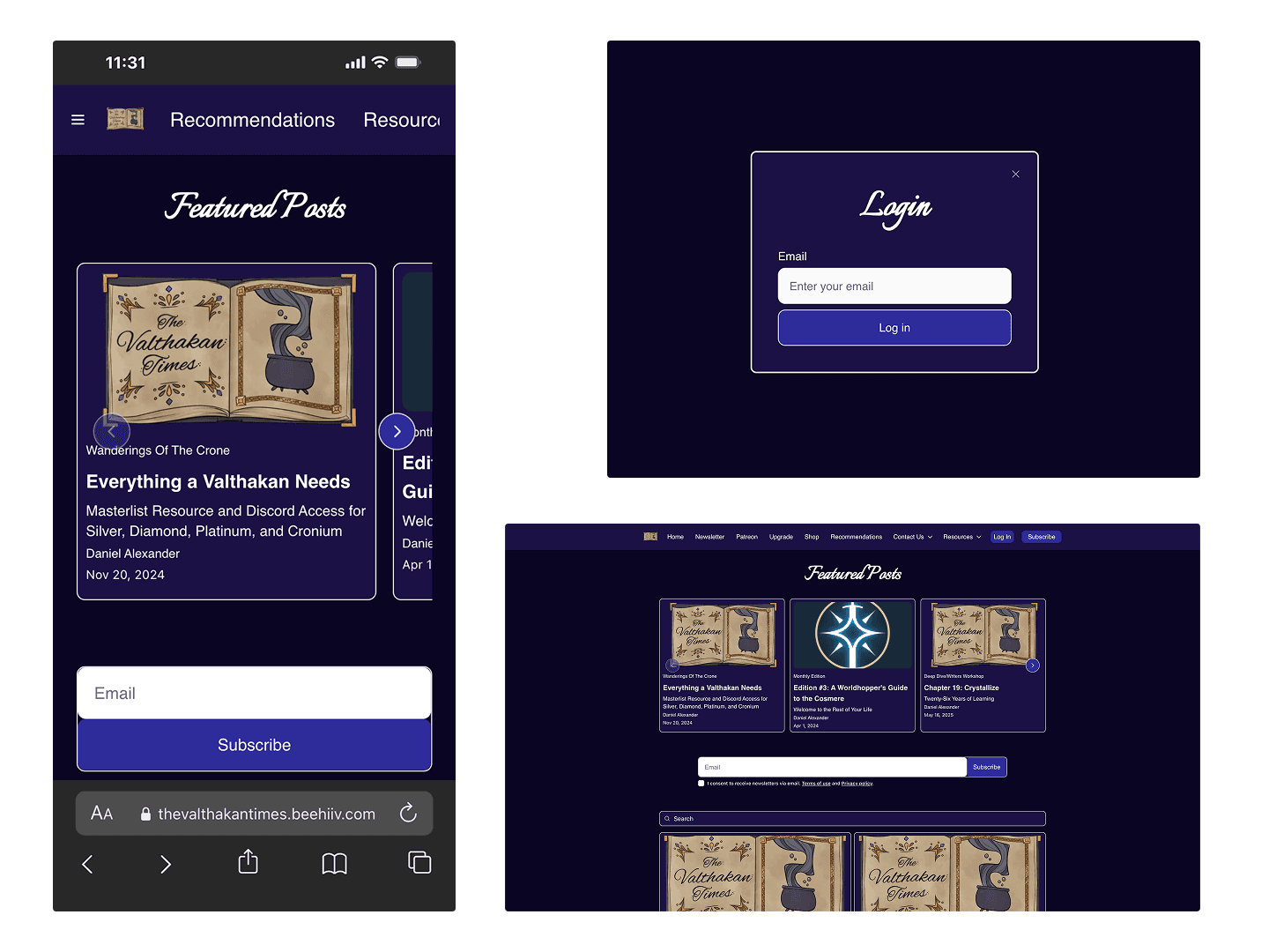
Solution 1 — Add Subscribe to mobile navigation
The Subscribe option was missing from the mobile menu entirely. Users had to scroll and search to find it. We added it directly to the navigation so the most important action was always one tap away.

Solution 2 — Consolidate all platform plans on one page
Users were confused by having Beehiive and Patreon plans scattered across different pages. We brought everything together on a single Membership Pricing page with a platform toggle, making it easy to compare tiers and understand exactly what each plan included.

Solution 3 — Add lock icons to paid article cards
Users couldn’t quickly tell which content required a paid subscription. Adding a lock icon to premium article cards made the difference immediately clear without requiring users to read through the content.

The Result
These three changes worked together to make the subscription flow clearer, reduce confusion, and guide users more naturally toward upgrading. A clearer experience creates more confident users and more confident users convert.
Final Design
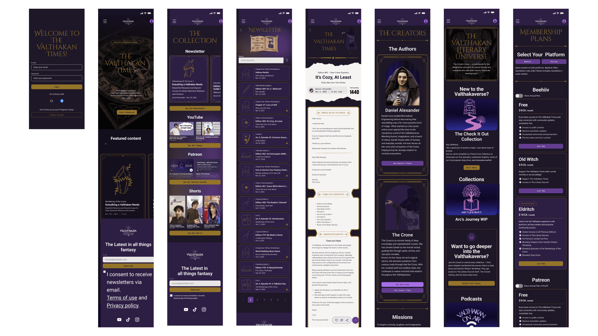
The final design delivers a mobile-first experience that makes Daniel’s platform feel as substantial as the community behind it. Navigation is clear from the first second — whether you’re a first-time visitor trying to understand what the Valthakan Times is, a loyal reader ready to upgrade, or a brand looking for partnership details, the path is there without having to go looking for it.
The visual system: the typography, the colour palette, the hierarchy , gives the brand a presence that matches the quality of the content it publishes. It doesn’t just look better. It works harder.

Reflection

Winning the Client Choice Award was validating, but what stuck with me more was the usability testing. Seeing real users struggle with subscription clarity (something we thought we had solved) was a good reminder that assumptions don’t survive contact with actual people. The iterations we made after testing were some of the strongest design decisions in the whole project.
Working in a team of designers also pushed me to be more intentional about documentation. When multiple people are building the same system, consistency doesn’t happen by accident. It comes from a shared UI kit, clear rules, and constant communication. That discipline carried into how I approach solo projects now.
If I could go back, I’d spend more time on the Community page earlier in the process. It ended up being the most complex page I owned, and some of the structural decisions would have benefited from an extra round of testing.


